

People that cook recipes that they find frequently face roadblocks when cooking recipes. Users need to constantly scroll mid-cooking, and are unaware of how many pots and pans are needed. This causes users to have a negative user experience.
The solution was an app that allows for a "cooking mode", which eases scrolling and also has a video function to assist users while cooking.
To start off the Google Ventures design process, I started with conducting research. The UX research methodology that I chose to use is secondary research since there was a time constraint involved in this project.
I chose to conduct secondary research for efficiency. Research was conducted on experiences with cooking for the first time. Research showed that users could be unsure what kitchenware will be necessary while cooking a recipe. They also found that there may be too many steps and that it is easy to get lost along the way. Other users may face issues with timing, in the sense that a dish could have been finished quicker or is taking too long to complete. Clarity of instructions, especially complex definitions or techniques, is also necessary as some users may face confusion when trying to cook something for the first time.
Through the research that was conducted, I gained insights on potential problems that users may face while using a cooking app to cook for the first time. Based on the findings, issues that people may run into while cooking revolve around timing, clarity, and efficiency. To address these potential issues, the recipes should be easy to follow, and enjoyable to cook. By addressing these issues in the design of the app, users will have a better user experience while cooking.
To gather some inspiration for the app’s interface and features, I took a look at the Tasty app. The Tasty app is a cooking based app that allows users to browse, save, and cook new recipes.
Upon opening up the app, users are prompted with a screen to choose which types of recipes they would like to see in order to customize app experiences based on their preferences. There is also a list that allows the recipe’s ingredients to be added to make their shopping experience easier. Once you select a recipe, there is an estimated time frame which the recipe will take to complete, as well as a rating for the recipe.
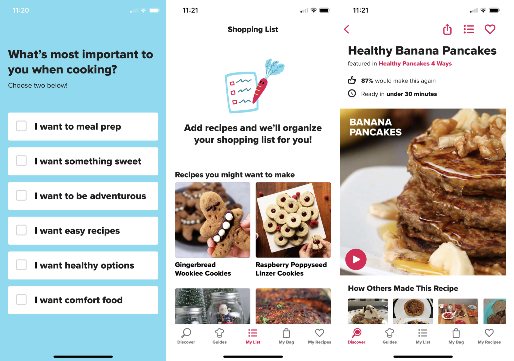
Next, I took a look at how a recipe would look after selecting a recipe. The recipe shows the exact amount of ingredients needed for a specific number of servings. The number of servings can be easily adjusted to reflect the ingredients needed. Ingredients are also easy to add to your grocery bag, making a shopping experience easy.
When users are ready to prepare the dish, the steps are listed out so that you can see the full list of steps. However, in addition, there is also a “step-by-step” mode feature that allows users to easily follow along while making a dish. Upon clicking this step-by-step mode, each step is shown one at a time along with a video for better instructions. This is a feature that I will draw inspiration for.
I also found that the Tasty app has a “tips” section, where other users submit tips and tricks to help with making the recipe. This is a very useful feature, so that any problems that other users face can be presented. Other helpful tips to improve the recipe could also be shared here.
I chose the most critical screen based on what users would spend the most time on, and the screen that would be the most useful when making a recipe. So in this case, the most critical screen is the recipe for a specific dish.
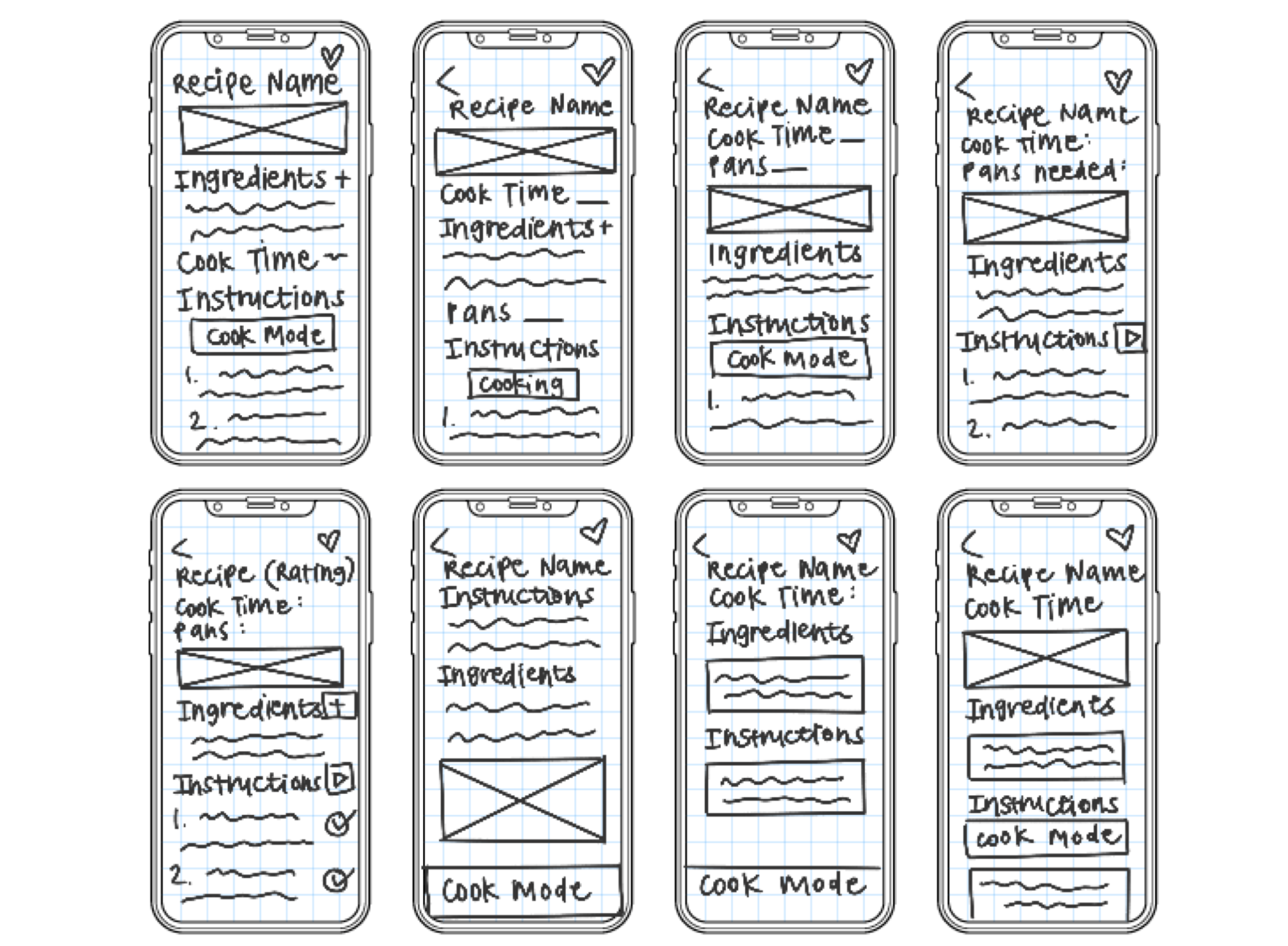
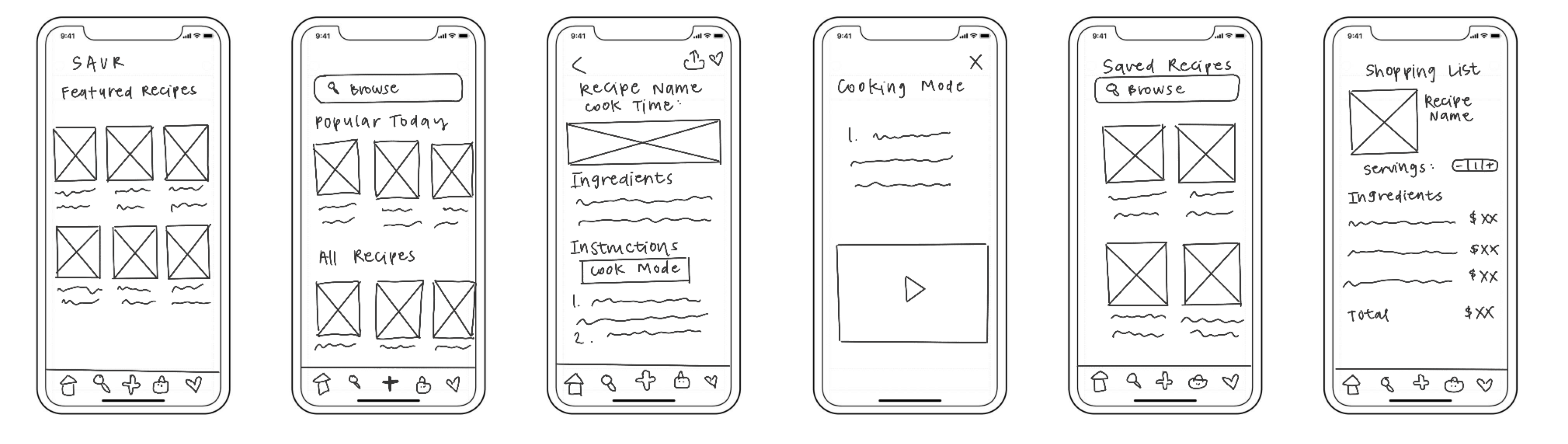
Building up from the solution sketch from day 3, I created a storyboard for the most critical screens in the Savr app. I included the screens that would be critical to the app's success.
In my design process, I gained inspiration from the Tasty app. I examined the usability of the competitor's app and analyzed which functions were the most efficient and would be useful to integrate into Savr. I made sure to include a user-friendly layout where they are able to browse many types of recipes, view their favorite recipes, and address users’ concerns in how to cook things step by step in “cooking mode”.
Since Savr is an app that reflects cooking, I wanted to choose a color palette that reflects that theme. According to psychology, the colors red and yellow are chief food colors that evoke your tastebuds and can also stimulate your appetite. In addition, they are effective at grabbing users' attention. To integrate psychology principles, I chose a range of red and yellow colors as primary colors.
To quickly build a prototype, I used Marvel. Typically, I use Sketch and Figma - however, Marvel is a rapid prototyping tool that met the needs of this project with a quick deadline.
The next phase was to test my prototype. I needed to test my prototype to gain real-time insight and feedback from users. Testing also helps discover users' pain points, needs, and goals.
To test the usability of the app interface, I conducted 5 usability tests with users that expressed an interest in cooking new recipes in order to ensure that I am only testing users within the target demographic.
Through interviewing the users, I found that users were able to find the action buttons quickly and navigate through the app. The participants noticed that the layout was very clean, had good spacing, and was easy to navigate. Users did not have any difficulty using the app. However, they did indicate that they would like to see more features and color on the app.
Through this design sprint, I learned a lot about designing under a quick timeline and how to create a prototype quickly to present. I was able to learn the basics of Marvel to create a prototype with the layout that I wanted very quickly. Through this process, I learned that it’s possible to deliver a prototype quickly with the right tools and planning. Although a lot of time typically goes into testing and designing, a quick turnaround time for a deliverable is possible if you utilize the right tools. However, testing and iterating are key components of UI/UX design, so in the future I will only use Marvel when I need a rapid prototype to meet a tight deadline.
To improve the design of this prototype, Marvel prototypes should be moved to Sketch and Figma to allow more design flexibility. Although Marvel was helpful to deliver a rapid prototype, capabilities were limited. After polishing the design over to Sketch or Figma, I would continue testing and iterating with the target demographic. As always, UI/UX design can always be improved because people and interests are constantly evolving.
If you like what you see and want to work together, get in touch!
uiuxtiff@gmail.com