
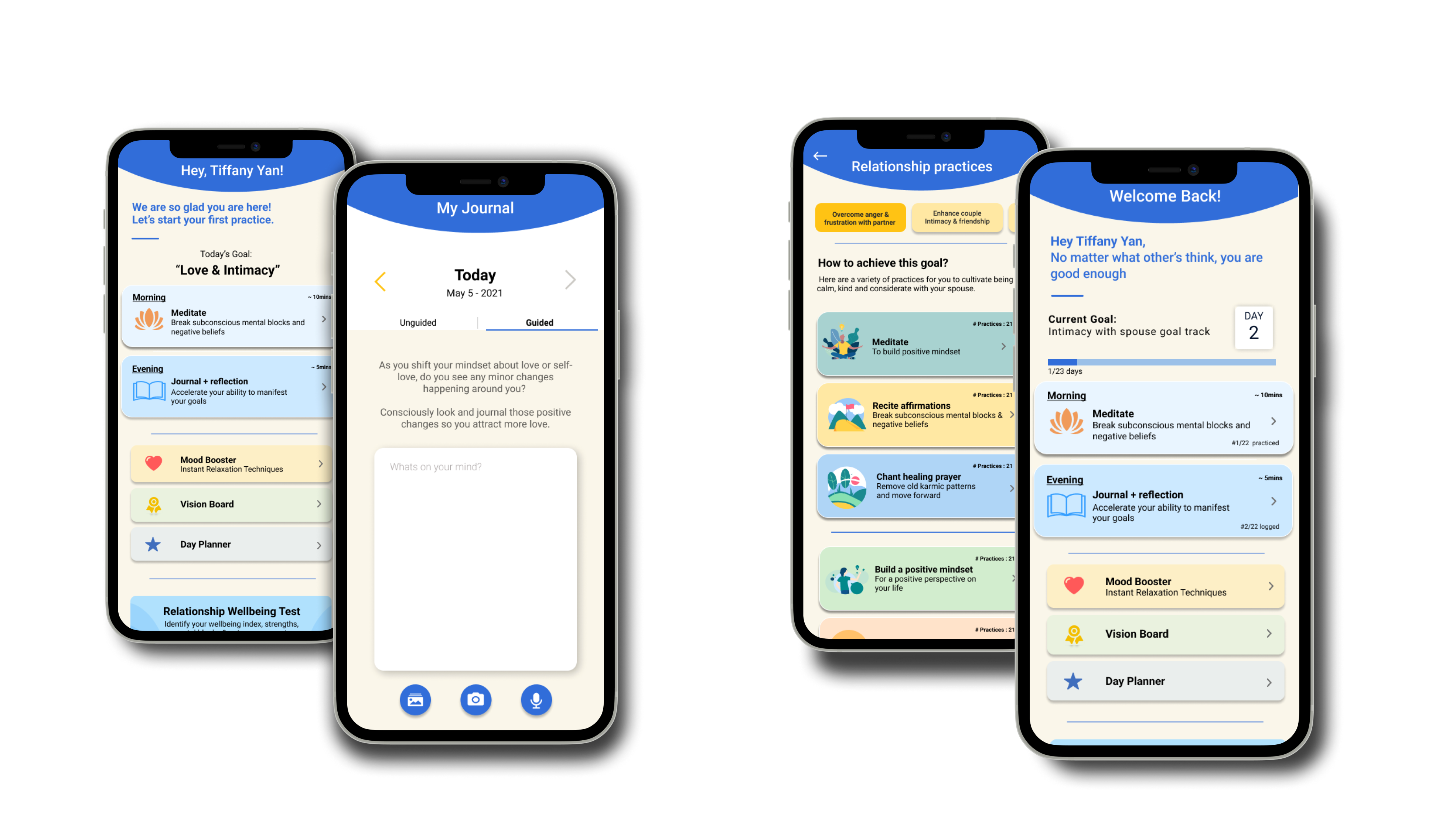

In order to get a better idea of the problem space and user pain points, I conducted UX research through usability testing with 5 participants on both iOS and Android devices. My main project focused on designing and iterating the Happy Being flow, however I also conducted usability testing on Android devices and provided feedback and recommendations for the user experience on both types of devices to developers.
• Loading speed was too long (>10 seconds)
• Too much information to read, along with grammatical errors
• Lack of visual hierarchy and information architecture
• UI could be improved, doesn't look visually appealing

After gathering feedback from usability testing, I sketched a multitude of possible iterations to make that addressed the usability issues identified by creating low-fidelity mockups to gather all my ideas and start user testing early in the process.

I conducted A/B testing first with possible solutions in order to identify the most suitable design that fit the target demographic. Through testing with 5 participants, I found that Screen #3 had the best feedback from interviewees.
I also conducted Guerilla usability testing afterwards to gather more information on user needs, goals, and pain points. I recruited participants from Springboard and UX Rescue's UI/UX Community. I found that users would like separate sections with dividers in between, with a clear goal on the page for better usability, as shown on Screen #3. Participants also reported that too much in one section was overwhelming, and would like components grouped together. Iterations were made while transitioning to high fidelity mockups to incorporate synthesized findings.
Based on synthesized findings, I made many iterations that reflect the usability issues that were identified, while still keeping the style guide in mind for overall app consistency. I designed high-fidelity mockups for the Happy Being "My Coach" flow to send to the CEO, which was the main point of focus for the app and would be used the most. This screen is critical to the app's success, so it was important to go through many rounds of testing and iterating.
Iterations were made based on testing and user feedback to address the identified issues. The Home page, My Coach screen, and journaling screen were iterated to reflect usability issues and improve the overall UX/UI design of the app on iOS and Android, with references to Human Interface Guidelines and Material Design Guidelines.


The main focus of my project was to iterate the Happy Being iOS flow. However, I also conducted usability testing on the Android app and delivered a usability report along with recommendations to the CEO and Developers at nSmiles.
Response times should always be as fast as possible. According to Jakob Nielson's book "Usability Engineering" and standard Human Computer Interaction Guidelines, operations that take longer than 10 seconds should have percent-done progress indicators. Nielsen's 3 response-time limits are determined by human perceptual abilities, with 10 seconds being the limit for a user's attention span before abandoning the site.
Happy Being's main features on the home app took over 30 seconds to load — and in their case, the probability of bounce will increase by over 123% — which would likely explain their lack of user retention after the sign-up flow. To address this problem, I urged developers to fix this as their top priority in the Happy Being usability report in order to boost UX and conversion, and reduce bounce rates.

Throughout the entire design process, I went through rounds of testing in order to better understand users and their pain points. Testing uncovered usability issues throughout the app on both iOS and Android, and the results and analysis were condensed into a usability report that was delivered to the developers and CEO in order to improve the overall design of the Happy Being app.


Click below to view the full usability report below, for Happy Being on iOS and Android:
Usability Testing Report for Happy Being
If you like what you see and want to work together, get in touch!
uiuxtiff@gmail.com