
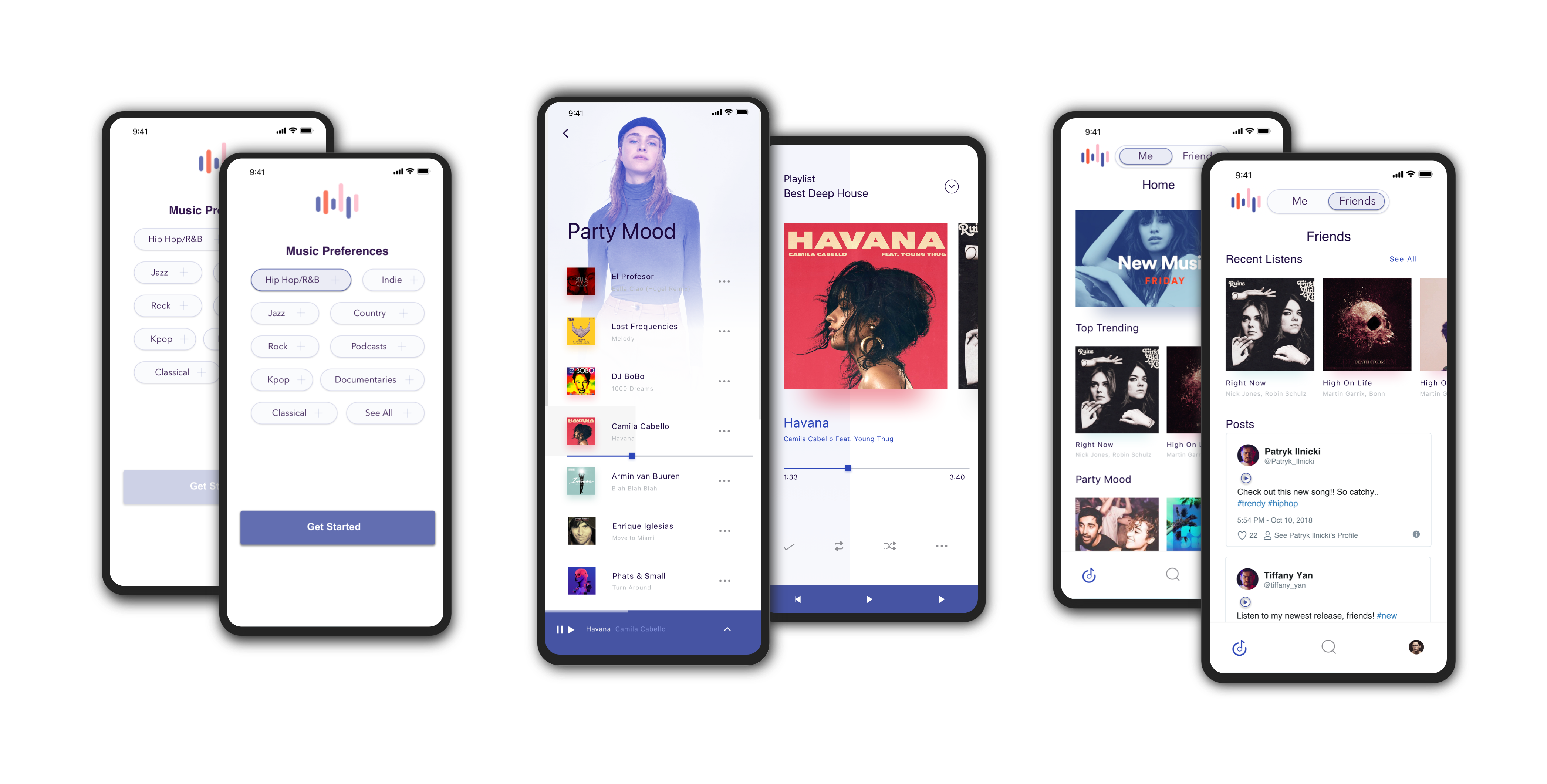
Behind my UX design process, I had user-centered design and design thinking in mind. I integrated Apple’s iOS Human Interface Guidelines and color contrast ratios for the best user experience.
In my design methodologies, I always use design thinking — in this project, I am utilizing Stanford's Design Thinking Process.

To explore different potential solutions, I took a look at how other teams have solved similar problems by diving into top media subscription apps. I conducted a flow analysis for YouTube, Spotify, and Pandora, since they are top competitors of Audion.
As I explored each company's approach, I took note of what went well and what didn't, and features that I would like to integrate into Audion.

In order to design the app towards the target market based on research findings, a few things were implemented based on analysis findings:
I conducted secondary research in order to gain more knowledge about the target users and competitors. Secondary research findings guided the app’s direction in having a social network as a key feature of this media subscription service.
To encourage users to upgrade and keep a paid premium service, secondary research findings were analyzed and considered. Since the intention to upgrade to a premium service depends on the benefits like the level of enjoyment and the price value of the subscription, an enjoyable but limiting free version must be made. And to retain premium subscriptions, social connectivity and the availability of new features need to be considered. However, it is extremely important to keep in mind how the cost of the premium version can benefit a user in comparison to the free version.
In order to maximize the user experience of Audion, some type of social network should exist to encourage more users, and an easy to use free version with many features (ex: recommendations, making and sharing playlists, finding new music, ads after only a certain amount of usage) would also encourage users to upgrade to a better premium version.

User flows are a visual representation of taking the steps through what happens as a user uses an app — in this case, a visual representation of the steps that a user goes through while using Audion. I created a user flow to visualize each step that a user takes in order to visualize key features.
To start off the ideation process, I used Procreate to draw wireframes. Sketching my thoughts allowed me to focus on the design first rather than the content. By drawing these low fidelity designs, I am able to get a better sense of how the visual hierarchy will be in the app’s design, and quickly draw out ideas to start usability testing.

After these low fidelity designs were created, I conducted a round of usability testing in order to guide my design decisions and make necessary adjustments for my high fidelity designs. I then gathered feedback then used Sketch to create my high fidelity design.
After synthesizing research from conducting usability testing on my lo-fidelity designs, I designed hi-fi screens in Sketch that incorporated the first round of test findings.
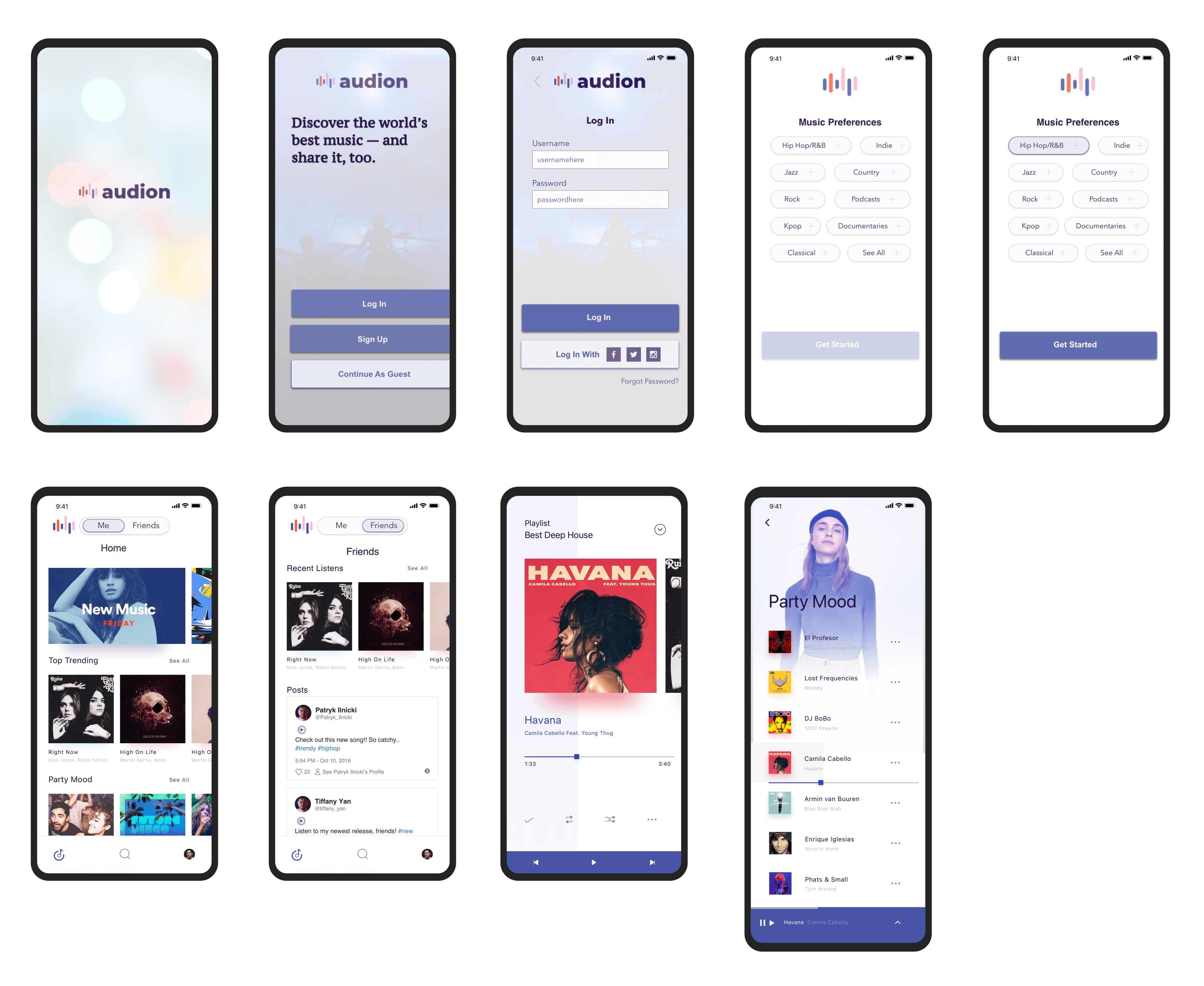
After ideating with sketches and gathering initial feedback from my first round of usability testing, it was time to bring my project ideas to life by creating a prototype.
I used Sketch to create and design my low fidelity mockups. After creating a Sketch file with mockups, I imported the Sketch file to inVision to add interactions between elements to create a clickable prototype.
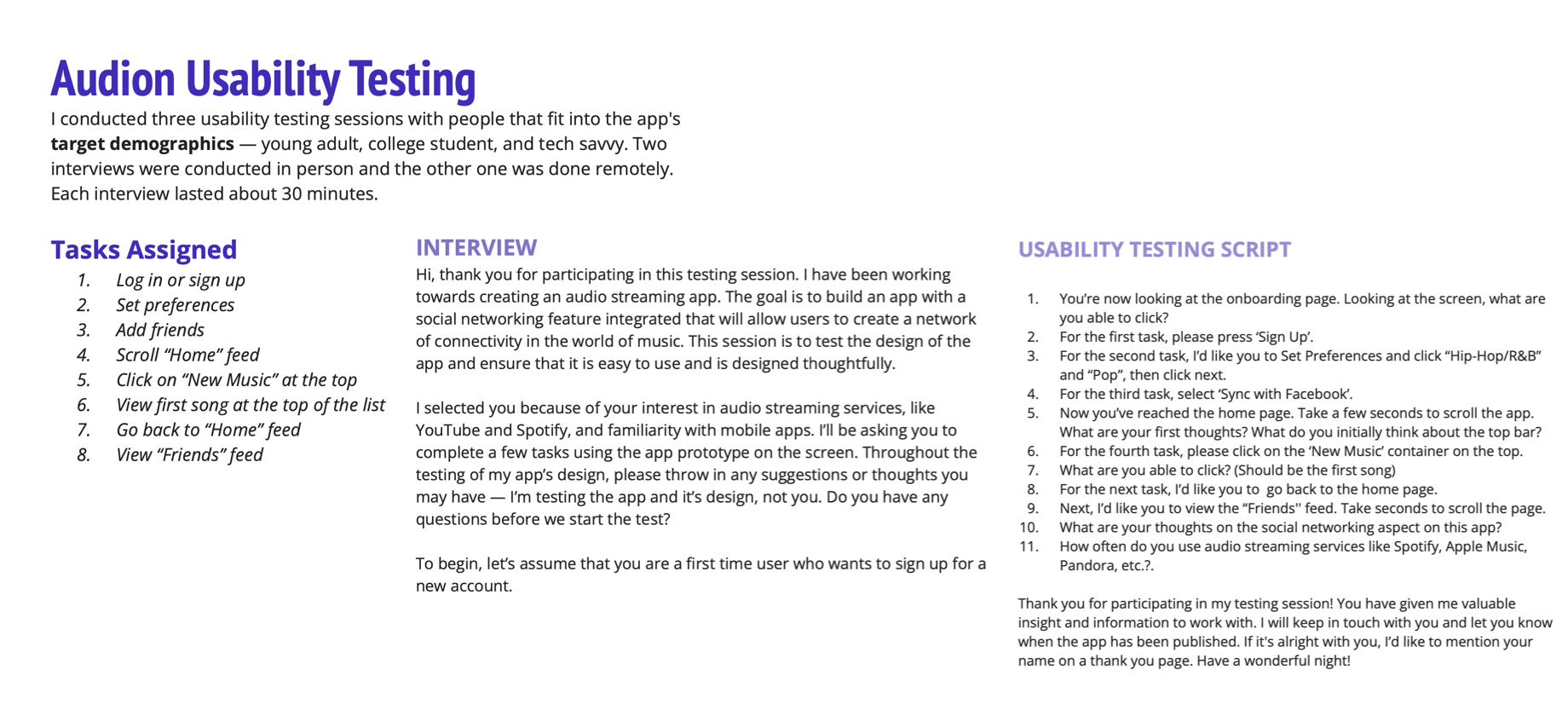
After designing both low and high fidelity screens for the key user flow, I conducted usability testing to validate my design decisions.
I conducted a total of six usability testing sessions — three sessions for low fidelity designs, and another three for high fidelity designs — with people that fit into the app’s target demographics: young adult, college student, and tech savvy. Interviews were conducted in person and remotely, with each testing session lasting around 30 minutes.
Usability testing is essential in making sure that the app is usable for a range of potential users and to gain valuable feedback for future improvements and iterations. I gained real time insight on the user flow with key findings for areas of improvement, giving me a guide to improve the overall UI/UX design.
From conducting usability testing sessions with a variety of users, I discovered some key changes to make that would improve Audion’s UI/UX design based on my findings while iterating my low fidelity designs to high fidelity mockups:
1. Problem: Unclear top header
2. Problem: Selecting a preference first is necessary to continue flow
3. Problem: Inconsistent bottom bar
4. Problem: Social networking apps have much higher usage than entertainment apps, including music streaming service apps like Spotify
Iterations were done using Sketch, Figma and Dribbble. Overall usability was improved through each rounding of usability testing by incorporating user feedback and frequently asking questions to look for areas of improvement.
Key Changes:
After the first round of testing my designs, I added more features to give users a larger variety of things that they are able to use on the app. Features seemed limited according to some feedback, and they would like to find an easier way to find and connect with friends. One suggestion was to be able to search friends by username, and have friend suggestions, in order to quickly build their network.
I built this app’s design with the idea of focusing on a social network to build a solid social foundation for users to connect on. Music subscription services tend to focus a lot on content rather than sociability. However, I learned to build an app that shows both with equal importance. Graphics were created through Sketch and Figma with some graphics from UI Kits, which I learned how to better source.
The biggest lesson that I learned from this design project is that good design takes a lot of time and testing. The more time that you put into researching, design, testing, and iterating — the better your design will be. I am excited to continue growing and learning more about UI/UX design, as there is an endless stream of new information and methodologies to learn and integrate in order to sharpen your design skills.
If you like what you see and want to work together, get in touch!
uiuxtiff@gmail.com